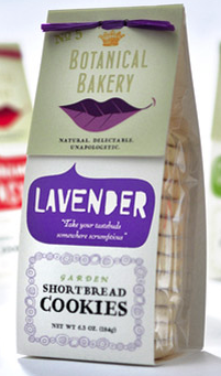
This is the packaging that I will be analysing for this blog post.
The product is Lavender Shortbread Cookies by Botanical Bakery. The colour theme for this product is purple, cream and a grey-green colour. These colours all link in with the Lavender flavour which when in flower form is a vibrant purple, it also links with the name of the company which create this product. There is high saturation of the colour purple which create the background colour of the speech bubble.
There are at least 5 different fonts which are used on the packaging of this products which makes it stand out with its diversity however at the same time, they all link in together and so create a visually attractive design. The font of the flavour is a more relaxed font, almost seeming like it was handwritten with a board marker whilst the actual name of the type of product, in this case shortbread cookies, seems more old fashioned as it is in a series font which reminds me of old fashioned traditional bakeries.
There is one image which stands out to me the most and this is the leaf. Firstly its purple which fits in with its theme, its a leaf which links with the natural nature of the shortbread cookies and finally it resembles a month. This therefore appeals to a female audience and links with the feminine theme of the packaging. There is also an intricate design around the name of the product and sop also supports the feminine nature of the design.
An appeture is used around the age of the design to show the actual product whilst also having a practical nature of keeping the food fresh and safe from any outside containers.

Another excellent analysis Issy. You have found meaning in the colours used, the fonts and the image. You have connected this with the target audience and the subtle way the designer as used certain elements to create a packaging design that is both traditional and edgy. How can you use these techniques in your design? I love the use of the leaf by the way, very clever and I didn’t see hat straight away. This is called ‘A smile in the mind’/.
LikeLike